


Table of Contents
- Introduction
- Why Design Principles Matter
- Balance: Achieving Harmony in Design
- Contrast: Enhancing Visual Appeal
- Alignment: Structuring Your Design
- Proximity: Clustering for Clarity
- Repetition: Building Consistency
- Hierarchy: Directing the Viewer’s Focus
- White Space: Less is More
- Color: The Psychology Behind Design
- Typography: Shaping Textual Impact
- Visual Consistency: Ensuring Cohesion Across Designs
- Applying Design Principles in Projects
- Conclusion
Introduction
Design principles serve as the foundation upon which all visual communication in the field of graphic design is constructed. These design principles help you make practical and visually appealing design decisions, whether you’re constructing a website, coming up with a brand logo, or developing a marketing campaign.
Knowing the fundamentals of design enables you to produce visually striking and functional designs. You will learn about the fundamentals of design from this blog and how to incorporate them into your own work.

Why Design Principles Matter
To produce a visually appealing product that is harmonious, well-organised, and balanced, design principles are necessary. They support the effective organisation of your content, direction of the viewer’s gaze, and delivery of your message. In the absence of these guidelines, designs may come across to viewers as chaotic, unprofessional, or unclear.
For example, by employing design principles like hierarchy and contrast, you can draw the viewer’s focus to the most crucial components of your design. Meanwhile, to keep your design feeling solid and well-organised, keep things close together and in balance.
Balance: Achieving Harmony in Design
Designing balance is achieved by evenly spacing out items in your layout. A well-balanced design, whether it is achieved by symmetrical or asymmetrical balance, has a sturdy, polished appearance.
- Symmetrical Balance: Elements are evenly distributed, giving a sense of harmony and order.
- Asymmetrical Balance: Different-sized elements are used to create a dynamic balance.
In order to create designs that are both aesthetically pleasing and feel sturdy and well-organised, both types of balance are important.

Contrast: Enhancing Visual Appeal
One important design idea that helps in setting certain pieces apart from one another is contrast. Use contrasting colours, forms, or textures to draw attention to key areas of your design and provide visual interest.
For example, bold headlines with smaller body text or light lettering on a dark background can produce an eye-catching and useful contrast. When contrast is used effectively, your design will be both aesthetically pleasing and simple to understand.
Alignment: Structuring Your Design
Elements can be arranged using alignment to make them appear cohesive and related. A well-aligned design promotes harmony and order, which facilitates viewer navigation.
Text, graphics, and other elements can all be aligned to naturally direct the viewer’s attention across the design. On the other hand, misalignment can give the impression that your design is disorganised and unclear.
Proximity: Clustering for Clarity
The arrangement of similar objects together is referred to as proximity. By establishing a visual relationship between elements, this design approach helps viewers understand more fully how various components of your design relate to one another.
To guarantee that the audience perceives headlines and body text as part of the same concept, for example, keep them near together. Making effective use of proximity enhances your design’s readability and clarity.
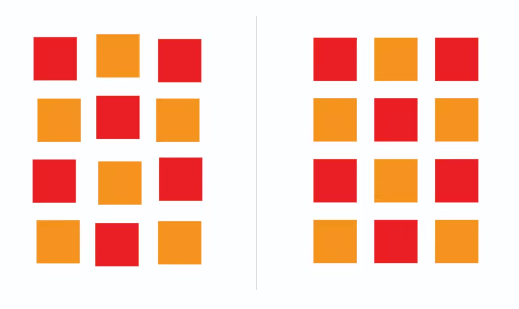
Repetition: Building Consistency
One of the best design strategies for creating consistency is repetition. You can establish consistency across your design by repeating elements such as colours, typefaces, and shapes.
In branding, repetition is especially crucial because it strengthens a visual identity on various media. Repetition ensures consistency, which makes your design feel logical and professional whether you’re developing a website or a business card.
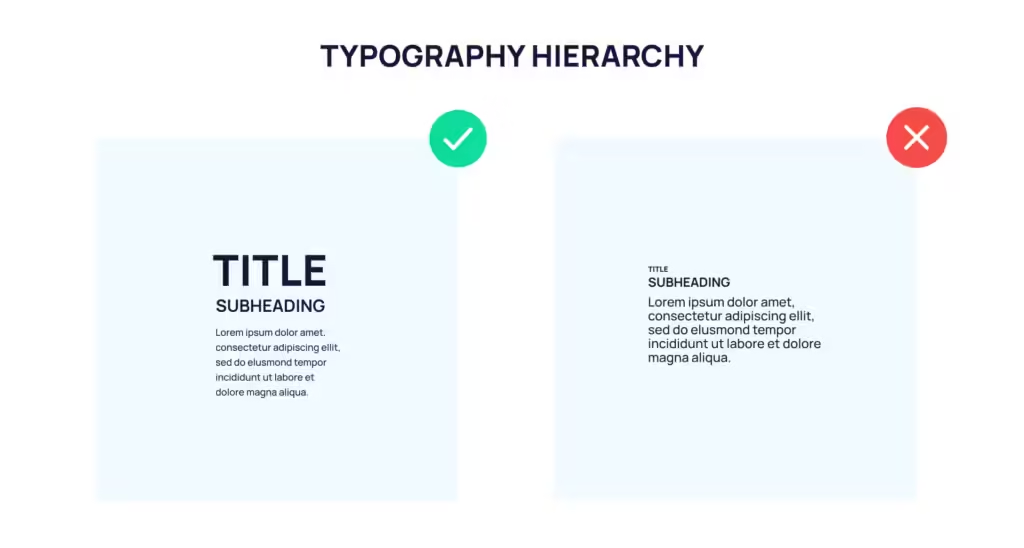
Hierarchy: Directing the Viewer’s Focus
The arrangement of items in a hierarchy directs the viewer’s attention to the most crucial information first. It’s crucial to follow this design approach to make sure your audience knows where to focus.
You can use positioning, contrast, or size to establish hierarchy. Bold headlines, for instance, naturally grab attention before smaller body material. Proper use of hierarchy increases the flow and readability of your design, ensuring that the viewer can rapidly absorb the important information.
White Space: Less is More
Negative space, sometimes referred to as white space, is a crucial yet frequently disregarded design element. It describes the portions of your design that lack any text or pictures. The entire composition feels more balanced and less cluttered when there is white space around your design pieces.
A perception of sophistication, attention to important details, and improved readability can all be achieved through the effective use of white space. It also lessens eye strain, which enhances the pleasure of interacting with your design.
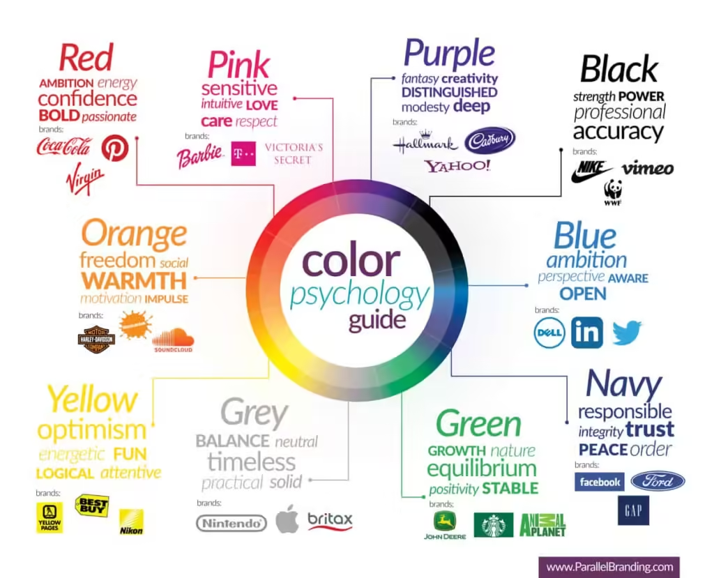
Color: The Psychology Behind Design
One of the most important design principles that affects how people see and respond to your work is colour. Different hues evoke various feelings and reactions. As an illustration:
- Red: Represents excitement, passion, and urgency.
- Blue: Conveys calm, trust, and professionalism.
- Green: Often associated with nature, health, and tranquility.
Knowing the psychology of colour will help you choose designs that are appropriate for your target audience and message. A cohesive design is also influenced by the colour combinations you choose.
Typography: Shaping Textual Impact
One important design guideline that impacts your design’s readability and visual attractiveness is typography. The entire appearance and feel of your design can be greatly influenced by selecting the ideal typeface and positioning the text.
- Serif fonts are often used in more formal designs.
- Sans-serif fonts are commonly used in modern, clean designs.
Typography includes not only the selection of fonts but also text size, alignment, and spacing. Using the right font makes your text easy to read and enhances the overall appearance.
Visual Consistency: Ensuring Cohesion Across Designs
Keeping visual consistency is a fundamental design guideline that helps you produce work that is polished and clear. Maintaining a consistent style throughout many projects or platforms with regards to colours, fonts, and layouts makes your design instantly recognisable and memorable.
This is especially crucial for branding, as audience recognition and trust are developed through consistency. Using a consistent design strategy enables you to give your audience a smooth visual experience.
Applying Design Principles in Projects
The true power of design principles lies in how you apply them to real-world projects. Whether you’re working on a branding project, web design, or even a flyer, using these principles will guide your decisions and help you create effective designs.
- Start with Empathy: Understand the needs and preferences of your target audience.
- Define the Problem: Clearly identify what you want to communicate through your design.
- Apply the Principles: Use balance, contrast, alignment, and other principles to structure your design.
- Prototype and Test: Create drafts of your design and test them with real users to gather feedback.
Conclusion
To create visually appealing and functional designs, one must understand and apply design concepts. Every choice you make, from font and hierarchy to layout and colour, is based on these guiding principles. You may create designs that not only look excellent but also communicate effectively by understanding these ideas.
Here’s your go-to guide for everything you need to know about Business Startup.
https://blogs.devartverse.io/category/graphics-designing
Thanks for Reading.