


Typography plays a pivotal role in how a message is perceived. The right font can evoke emotions, establish trust, and even drive action. Whether you’re designing a logo, a website, or a social media post, understanding typography can elevate your design from good to extraordinary.
Table of Contents
- Why Typography Matters
- The Basics of Typography
- How to Choose the Right Font
- Common Font Categories and Their Uses
- Typography Mistakes to Avoid
- When to Experiment with Typography
- Conclusion
Why Typography Matters
Typography is more than just selecting a font. It’s about creating harmony between text, visuals, and the message you want to convey. Good typography:
- Enhances readability and user experience.
- Communicates your brand’s tone and personality.
- Helps establish a hierarchy, guiding the reader’s attention.
The Basics of Typo
Before diving into font selection, let’s break down some key typography terms:
- Serif vs. Sans Serif: Serif fonts have small lines or strokes attached to letters, while sans serif fonts do not.
- Kerning: The space between individual letters.
- Leading: The spacing between lines of text.
- Hierarchy: Organizing text elements to guide readers’ focus.

How to Choose the Right Font
- Understand Your Audience
Think about who will be reading your content. A playful, handwritten font might appeal to a younger audience, while a clean, modern font works for professionals. - Match the Mood
Fonts carry emotional weight. For example:- Bold fonts convey strength and confidence.
- Script fonts add elegance and sophistication.
- Keep Readability in Mind
No matter how beautiful a font looks, it’s useless if it’s hard to read. Stick to clean, legible fonts for body text.

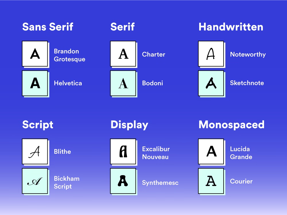
Common Font Categories and Their Uses
1. Serif Fonts
- Commonly used for print materials like books and newspapers.
- Conveys tradition and reliability.
- Example: Times New Roman.
2. Sans Serif Fonts
- Perfect for digital platforms.
- Gives a modern, clean, and approachable feel.
- Example: Arial.
3. Script Fonts
- Ideal for invitations or logos.
- Conveys elegance and creativity.
- Example: Pacifico.
4. Display Fonts
- Best for headlines or branding.
- Bold and attention-grabbing.
- Example: Impact.
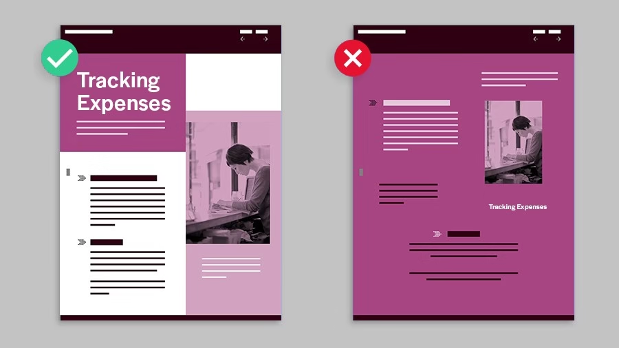
Typography Mistakes to Avoid
1. Using Too Many Fonts
Limit your design to 2-3 complementary fonts. Too many fonts can make a design look chaotic.
2. Ignoring Hierarchy
Use size, boldness, or color to emphasize the most important text elements.
3. Overlooking Readability
Avoid fonts that are too thin, tightly spaced, or overly decorative for body text.
4. Not Testing on Different Platforms
Always test how your typography looks on various devices and screen sizes
When to Experiment with Typo
Experimentation with typography can lead to unique and memorable designs, but it must be done with caution. Here’s when and how to experiment:
1. Creating a Distinct Brand Identity
When launching a new brand, experimenting with unique typography styles can set your identity apart. Custom fonts or creative arrangements can make your brand memorable.
2. Targeting a Specific Audience
If you’re designing for a niche market, unconventional typography can resonate more deeply. For instance, edgy fonts might appeal to a younger, trendier audience.
3. Making an Impact
Headlines, advertisements, or promotional materials can benefit from bold, experimental typography to grab attention and communicate your message strongly.
Conclusion
Typography is more than just a design choice; it is a strategic tool that bridges aesthetics and communication. The fonts you choose have the power to shape perceptions, evoke emotions, and guide actions. Whether you’re crafting a brand identity, designing marketing materials, or creating digital content, thoughtful design choices are essential.
Remember, simplicity often speaks the loudest. A well-chosen font can make your message resonate with the right audience without overshadowing it. Avoid common mistakes like overloading designs with fonts or neglecting readability. Instead, aim for harmony, consistency, and purpose.
When experimenting with design, always consider the context and audience. While creativity is important, functionality should never be compromised. Test your designs across platforms and gather feedback to ensure they align with your goals.
In today’s visually driven world, design is a critical element of storytelling. It’s not just about what you say but how you say it. With the right knowledge and application, your choices can truly speak volumes.
Here’s your go-to guide for everything you need to know about Design
https://blogs.devartverse.io/category/graphics-designing
More for other blogs that are valuable to know.
Thanks for Reading.